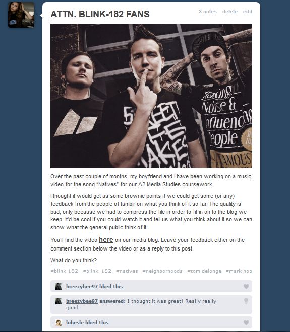
How Effective is the Combination of Your Main Product and Ancillary Texts?
Throughout our project one of our main goals has been to try and maintain a visual link across our webpage, digipak and video. As the above images depict, I would say that we have been fairly successful in this. Both the digipak and webpage are both linked visually through the iconic Blink 182 logo which has been their staple since 2003. They are also linked through the style of font, and black and white street photography that Sarah took. The webpage and digipak both have a very limited colour pallet, being almost entirely black and white to try and capture moodiness and angst. However, using simple black and white for our video would have looked plain and dull, so instead we simply adjusted the lighting and used iMovie effects to darken the tone even further. To this end, we were pleased in the way that all three aspects of the project have a dark tone that implies the mature and dark subject matter of the song. In short, it all looks and feels like Blink 182 and that should apply to all the right people (namely, Blink fans young and old).
Existing Digipaks and Webpages
Above is an image from Blink's most recent video, which shows a dark and moody looking lighting effect. Also on display is the Blink webpage and the Boxcar Racer digipak. These things appeal to their audience by being simple yet stylish and accessible. This mirrors what we have done, not making things to complicated and having it all as stripped back as possible while still looking stylish, iconic and onbviously Blink 182.
Question 2: How effective is the combination of your main product and ancillary texts?
Throughout the campaign, we have attempted to maintain a clear theme through several different factors. First of all, I feel that the colour scheme we have used throughout helps to make the three media products clearly related to the same artist and idea. Within the digipack and the website, there is a black and white theme, which uses similar photographs from the same locations and images of the band. The splattered paint is a feature that can be seen in both, along with the smiley logo that is apparent in most of Blink-182's products. We wanted to make sure the two were similar enough that they would have a clear link, as is seen on the current Blink-182 website where the album cover is used as the website background and clearly advertised throughout the site. We have included the single cover in the website to further advertise the band's music and the new music video we created. The video is clearly linked to these two media products in a way that the theme is kept looking moody and grunge like throughout, the tones and colours included in the video are muted in a way that keeps in line with the tone of the entire song.
The three are interrelated in a way that they all incorporate clear reference to the band. As stated before the use of the same themes and logos throughout shows they are linked to the same band and by incorporating pictures of our "band members" from the video into the digipack and website, the viewer can make an obvious connection to what they have seen in the video and what is present in the digipack and website.
I feel they target the audience quite well through the use of suburban, familiar locations that could be related to by teens and young adults. The use of teen actors would also help to make our target audience feel like they can relate to the song, the band and the subject matter, which targets the issue of teen angst/depression and homelessness.
Existing digipack and webpage:
These media products help to sell the artist in many ways. As is typical of the genre conventions of pop-punk, the band are very rarely seen on the front cover of the album. This is seen here, with Fall Out Boy's album From Under The Cork Tree and also with all of Blink-182's albums. They are, however, featured on the website. I feel this is done so that a relationship between the consumer and the music is established initially through the album, and then when this is done, the consumer will continue on to find out more about the band and their background, therefore wanting to know what they look like. We can also see links to things aimed at the fan base such as message boards and merchandise. We also see a "tour" tab, which would be another way to sell the band and their music. We have mirrored many of these features in our own media products. We have avoided putting images of the band on the front cover of the digipack to fit with genre conventions, however we have put images of them on the inside cover, as is seen similarly in the Blink-182 album Take Off Your Pants and Jacket. Our website also has the generic conventions of a band website, including tabs for tour dates, photos and information on each band member.
Question 1: In what ways does your media product use, develop or challenge forms and conventions of real media products?
Our video for the song "Natives" by Blink-182
The video for "Boulevard of Broken Dreams" by Green Day
The video for "Adam's Song" by Blink-182
Shown above are the videos for three songs - "Natives" by Blink-182 which is the song that Ewan and I created a music video for, "Boulevard of Broken Dreams" by Green Day and lastly "Adam's Song" by our chosen artist, Blink-182. The two existing videos show the genre conventions of pop-punk very clearly - the use of lighting, location and subject matter all point towards the more serious, melancholy side to the music genre of pop-punk. Although the genre lends itself to the more humorous and fun side of music, it also tends to dabble in the more serious side occasionally and to good effect. I believe that in many ways, our music video has also stuck to the conventions of a pop-punk music video through the connection between its subject matter and mis-en-scene.
As seen in the previous Blink-182 video, the subject of suicide is addressed in the lyrics of the song, and the entire mood is generally quite morose. We thought that our song choice was also based around the same sort of topic - the idea of loneliness, isolation and depression - and therefore we decided that it would be best not to challenge the genre conventions to avoid creating something that was inappropriate and inevitably ineffective also. By having a serious approach to the video, I feel we have conformed to the general conventions of a pop-punk music video in a way that benefits our video significantly. Similarly, the video for "Boulevard of Broken Dreams" demonstrates the same sort of mood and subject matter which is typical of a ballad-like, sad pop-punk song. In this way, the two videos has several similarities in their mise-en-scene qualities, including their use of dull and muted lighting/colours and run down environments and locations, such as the warehouse in "Adam's Song" or the deserted town in "Boulevard of Broken Dreams". The idea of homelessness and isolation is something we incorporated into our own video and I think the locations we used were sensible, appropriate and effective in making the narrative of our video look convincing and visually appealing. I especially feel that our band performance location is very effective.
Another aspect of pop-punk videos that we thought we should conform to is the split of narrative and performance - as seen in the two previously existing videos and our own video, there is almost an equal split on performance and narrative, which gives a good amount of variety and a sense of reality to the video, to ensure that the viewer is fully engaged throughout and also, the band themselves are being promoted/sold in the video. We used differing shot types to keep the video interesting and dynamic whilst also taking into conideration hwo these shot types would work best with regard to our actors and performers.
With regards to postmodern ideas, we decided to use a slight sense of intertexuality in our video, but in a discreet and appropriate way. We incorporated a Blink-182 poster into our video, which is only seen briefly. We also got the actor to dial the number "182" in the phone booth, which we believed was a sneaky way to fit the band name into the video.
I thought another way that we used genre conventions is within the narrative itself. We made a conscious effort to ensure that the main character in our video is treated badly from start to finish, with no real care and attention being paid to him at all. This can also be seen in the video for "Adam's Song" where we see still frame shots of the band coming across the characters who are 'in trouble' and yet they pay no real attention to them whatsoever. We thought this was interesting, as usually music is seen to be people's 'saviour' whereas in this case, and in the case of our own music video, we see that the music treats him just the same as everyone else.
Question One: In what ways does your media product use, develop or challenge forms and conventions of real media products?
Our video for Natives
The official Blink-182 video for Up All Night
Sum 41's music video for their single, Pieces
All three of the above songs deal with a dark subject matter. Natives deals with running away and isolation. Up All Night deals with angst and the fears of growing up and Pieces deals with depression and isolation. Up All Night and Pieces both have moody, dark lighting, something we wanted to achieve with our video and for the most part have. Usually Pop Punk doesn't look like this, but as we have mentioned in the blog before the genre can do "mature" and it always looks like this, dark lighting and old, run down urban/suburban locations. The emphasis on suburban life as seen in Up All Night is something we wanted to do mostly because it was easier to shoot in suburban areas, as well as the fact it follows the conventions. Our choice of location for the performance was taken from Up All Night. We wanted an area that looked fairly ruined and desolate to represent what homelessness is. The point was to try and show that it isn't a nice thing and that they are alienated from society, the band are playing in an isolated area surrounded by junk and rubbish. In the Up All Night video, they're playing in a ruined street, but we obviously couldn't afford to make it look quite so cinematic. In both Pieces and Up All Night, the entire videos are shot at night. This is something we considered doing as it may well have suited the tone of the song better. In the end it just became an impossibility as our actors had work/other commitments etc. Arguably in that respect we have challenged the standard convention and still managed to give the video a dark style through editing and playing with exposure on the actual camera. Many in our media class did comment on liking the distinction in lighting between band sections and narrative points. In this way we again challenged the norm as in Up All Night there isn't a distinct switch in light or tone. As for Postmodern concepts, we have indulged in intertextuality by showing a Blink-182 poster in Rory's room, and Rory dials 182 when in the phonebooth. Besides that, we show no sense of awareness as that might have underplayed the seriousness intended in the video. The same is true of Up All Night, which is played straight, despite a quick flash of the Blink logo on a fence. Pieces is different, having some arguably light moments of comedy with the people in the vans, though it might just be me who finds those scenes funny. Everything is subjective in the end.


