

Showing posts with label Sarah Carter. Show all posts
Showing posts with label Sarah Carter. Show all posts
Monday, 6 February 2012
Audience Feedback Wordle

Wednesday, 1 February 2012
Reflective Evaluation Sarah Carter
Question 2: How effective is the combination of your main product and ancillary texts?


Throughout the campaign, we have attempted to maintain a clear theme through several different factors. First of all, I feel that the colour scheme we have used throughout helps to make the three media products clearly related to the same artist and idea. Within the digipack and the website, there is a black and white theme, which uses similar photographs from the same locations and images of the band. The splattered paint is a feature that can be seen in both, along with the smiley logo that is apparent in most of Blink-182's products. We wanted to make sure the two were similar enough that they would have a clear link, as is seen on the current Blink-182 website where the album cover is used as the website background and clearly advertised throughout the site. We have included the single cover in the website to further advertise the band's music and the new music video we created. The video is clearly linked to these two media products in a way that the theme is kept looking moody and grunge like throughout, the tones and colours included in the video are muted in a way that keeps in line with the tone of the entire song.
The three are interrelated in a way that they all incorporate clear reference to the band. As stated before the use of the same themes and logos throughout shows they are linked to the same band and by incorporating pictures of our "band members" from the video into the digipack and website, the viewer can make an obvious connection to what they have seen in the video and what is present in the digipack and website.
I feel they target the audience quite well through the use of suburban, familiar locations that could be related to by teens and young adults. The use of teen actors would also help to make our target audience feel like they can relate to the song, the band and the subject matter, which targets the issue of teen angst/depression and homelessness.


Existing digipack and webpage:
These media products help to sell the artist in many ways. As is typical of the genre conventions of pop-punk, the band are very rarely seen on the front cover of the album. This is seen here, with Fall Out Boy's album From Under The Cork Tree and also with all of Blink-182's albums. They are, however, featured on the website. I feel this is done so that a relationship between the consumer and the music is established initially through the album, and then when this is done, the consumer will continue on to find out more about the band and their background, therefore wanting to know what they look like. We can also see links to things aimed at the fan base such as message boards and merchandise. We also see a "tour" tab, which would be another way to sell the band and their music. We have mirrored many of these features in our own media products. We have avoided putting images of the band on the front cover of the digipack to fit with genre conventions, however we have put images of them on the inside cover, as is seen similarly in the Blink-182 album Take Off Your Pants and Jacket. Our website also has the generic conventions of a band website, including tabs for tour dates, photos and information on each band member.

Monday, 30 January 2012


Thursday, 26 January 2012
Reflective Evaluation Sarah Carter
Question 1: In what ways does your media product use, develop or challenge forms and conventions of real media products?
Our video for the song "Natives" by Blink-182
The video for "Boulevard of Broken Dreams" by Green Day
The video for "Adam's Song" by Blink-182
Shown above are the videos for three songs - "Natives" by Blink-182 which is the song that Ewan and I created a music video for, "Boulevard of Broken Dreams" by Green Day and lastly "Adam's Song" by our chosen artist, Blink-182. The two existing videos show the genre conventions of pop-punk very clearly - the use of lighting, location and subject matter all point towards the more serious, melancholy side to the music genre of pop-punk. Although the genre lends itself to the more humorous and fun side of music, it also tends to dabble in the more serious side occasionally and to good effect. I believe that in many ways, our music video has also stuck to the conventions of a pop-punk music video through the connection between its subject matter and mis-en-scene.
As seen in the previous Blink-182 video, the subject of suicide is addressed in the lyrics of the song, and the entire mood is generally quite morose. We thought that our song choice was also based around the same sort of topic - the idea of loneliness, isolation and depression - and therefore we decided that it would be best not to challenge the genre conventions to avoid creating something that was inappropriate and inevitably ineffective also. By having a serious approach to the video, I feel we have conformed to the general conventions of a pop-punk music video in a way that benefits our video significantly. Similarly, the video for "Boulevard of Broken Dreams" demonstrates the same sort of mood and subject matter which is typical of a ballad-like, sad pop-punk song. In this way, the two videos has several similarities in their mise-en-scene qualities, including their use of dull and muted lighting/colours and run down environments and locations, such as the warehouse in "Adam's Song" or the deserted town in "Boulevard of Broken Dreams". The idea of homelessness and isolation is something we incorporated into our own video and I think the locations we used were sensible, appropriate and effective in making the narrative of our video look convincing and visually appealing. I especially feel that our band performance location is very effective.
Another aspect of pop-punk videos that we thought we should conform to is the split of narrative and performance - as seen in the two previously existing videos and our own video, there is almost an equal split on performance and narrative, which gives a good amount of variety and a sense of reality to the video, to ensure that the viewer is fully engaged throughout and also, the band themselves are being promoted/sold in the video. We used differing shot types to keep the video interesting and dynamic whilst also taking into conideration hwo these shot types would work best with regard to our actors and performers.
With regards to postmodern ideas, we decided to use a slight sense of intertexuality in our video, but in a discreet and appropriate way. We incorporated a Blink-182 poster into our video, which is only seen briefly. We also got the actor to dial the number "182" in the phone booth, which we believed was a sneaky way to fit the band name into the video.
I thought another way that we used genre conventions is within the narrative itself. We made a conscious effort to ensure that the main character in our video is treated badly from start to finish, with no real care and attention being paid to him at all. This can also be seen in the video for "Adam's Song" where we see still frame shots of the band coming across the characters who are 'in trouble' and yet they pay no real attention to them whatsoever. We thought this was interesting, as usually music is seen to be people's 'saviour' whereas in this case, and in the case of our own music video, we see that the music treats him just the same as everyone else.
More public feedback
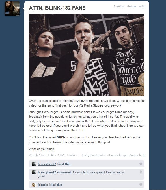
I've once again reviewed the feedback that we received on Tumblr from our video. We got some positive thoughts back:

Monday, 23 January 2012
Public Feedback
After posting a link to our video on the blogging website Tumblr, we received some feedback from the public about the strengths and weaknesses of the music video. We received two individual 'likes' on the video and were also given an in depth response from one person, to which we replied with our thoughts and answered his questions.
 Here you can see his response. We very much appreciated his thoughts and he later commented on Tumblr that he did really like the video and hoped it went well for us both, which we thought was nice of him.
I think this shows that we have taken into consideration what the public would expect from a Blink-182 video and have tried to create something that we think would appeal to fans of the band.

I think this shows that we have taken into consideration what the public would expect from a Blink-182 video and have tried to create something that we think would appeal to fans of the band.
Thursday, 19 January 2012
Public opinions on the video so far.
I decided that as a way of getting a wider, objective and more varied opinion of our music video so far, that I would share a link to our video on my personal blog on the website Tumblr.
 I will post any responses we get at a later date. Hopefully this will enable us to get some good, honest feedback from the general public and fans of the band.

Wednesday, 18 January 2012
Final Music Video 1
This is the first full edit of our music video. The quality is bad due to compression. Oh well.
Editing Update
In today's lesson, we made some final adjustments to our music video, ready to show Mel on Monday so she can give us feedback. We changed some of the lip-synching so it was more accurate and added in some more performance shots to break up the shots of vocal performance.
We also thought that the narrative shots of our main character outside were too sunny for the sort of feel we're going for. Obviously, the weather is something we can't change, so we decided to look into some effects to change the mood and tone of these shots. We found one that adjusted the colours and midtones of the shots, so used this to create a more gritty feel. We adjusted the saturation levels and increased the darkness slightly, which helps to remove the sunny glare you initially got from our narrative shots. I think it looks much better because of it.
We also thought that the narrative shots of our main character outside were too sunny for the sort of feel we're going for. Obviously, the weather is something we can't change, so we decided to look into some effects to change the mood and tone of these shots. We found one that adjusted the colours and midtones of the shots, so used this to create a more gritty feel. We adjusted the saturation levels and increased the darkness slightly, which helps to remove the sunny glare you initially got from our narrative shots. I think it looks much better because of it.
Tuesday, 17 January 2012
Filming and Editing update
Over the past week, we've been busy trying to get all of the filming we needed out of the way so that we could focus on editing over the next couple of weeks, before the deadline. On Sunday, we finished filming all of the narrative footage that we needed to complete our music video. It went pretty well, with very few glitches and I think the footage we captured was all very usable. We have decided that next weekend, if we have the time, we are going to re-shoot some footage to make sure that all of the shots we have are of a very good standard.
Over the past two days, both in lesson and in free time we have been editing our music video, to the point where today, I have finished putting all of it together. No doubt, there will be a few things that may need changing when our teacher looks at our work, but overall we're very happy with what we have so far. We hope that now we have finished a first edit, we will have plenty of time to try out effects and really perfect what may need tweaking. I will upload a rough version of the music video soon.
Over the past two days, both in lesson and in free time we have been editing our music video, to the point where today, I have finished putting all of it together. No doubt, there will be a few things that may need changing when our teacher looks at our work, but overall we're very happy with what we have so far. We hope that now we have finished a first edit, we will have plenty of time to try out effects and really perfect what may need tweaking. I will upload a rough version of the music video soon.
Monday, 9 January 2012
After Midnight: The new blink-182 video.
After Midnight is a slower, more ballad like song and therefore the pace is quite different to ours. However, the split of narrative and performance is quite similar and their use of a grungey, desolate and isolated environment for the setting of their performance is similar to the approach we were going for, which I think shows our knowledge of the genre and the band themselves.
I think that the performance side to this video shows some classic blink-182 features. We captured the same sort of characteristics in our band members that are reflected in blink-182 themselves, such as their interaction with the camera and their performance styles. There is very little direct eye contact and they don't seem to have any awareness that the camera is there, which is something that we have also included in our performance.
Another thing that I feel we have related to the band is the se of costume and mise-en-scene. The band have a very distinctive image that we have tried to mirror in our actors:


Monday, 19 December 2011
Feedback from Peers
We have shown the video so far to a few of our peers. We got some really good feedback from all of them and their comments were much appreciated. Some of the things that were commented on are:
- Our lip-synching has been done well and the shots match up with the rhythm of the music.
- The use of a variety of shot types used appropriately was very good.
- The change in the tone and colours between the indoor scenes and the band performance is effective and creates the sort of mood we were looking to create.
- The acting in the video is convincing and in keeping with the tone of the video, especially the mother role.
The Video So Far.
With the digipack out of the way, we can now begin to focus on our music video again. So far, we have about a minute of footage which comes at the end of the track. This is just due to the amount of film we have managed to shoot so far - we have the end scene completed whereas we are still awaiting more film to finish the other scenes.
Here is the compressed video so far. For some reason it has come out pixelated, but it's only a rough edit anyway.
Here is the compressed video so far. For some reason it has come out pixelated, but it's only a rough edit anyway.
Tuesday, 13 December 2011
Plans For This Week:
Our plans for this week are to finish the CD cover and website before the deadline on Thursday and also shoot some more footage for us to edit before we break up for Christmas.
On Wednesday, we will ensure that the digipack is as close to finished as possible, although we do need to use one more photo of the entire band that we don't have yet. We plan to do our full band photoshoot on Wednesday afternoon and then upload the best shot to the website on Thursday morning before the deadline.
We will also do a video shoot on Wednesday, given our actors are available, as we had to cancel a shoot on Sunday due to our lead character being absent. Hopefully this next shoot will involve capturing the main bulk of the video so that we have as little to do as possible when we get back after Christmas, as the deadline will then be quite close.
We are planning to book a camera and tripod out over Christmas to get as much footage as possible so we can then focus on editing when we get back.
On Wednesday, we will ensure that the digipack is as close to finished as possible, although we do need to use one more photo of the entire band that we don't have yet. We plan to do our full band photoshoot on Wednesday afternoon and then upload the best shot to the website on Thursday morning before the deadline.
We will also do a video shoot on Wednesday, given our actors are available, as we had to cancel a shoot on Sunday due to our lead character being absent. Hopefully this next shoot will involve capturing the main bulk of the video so that we have as little to do as possible when we get back after Christmas, as the deadline will then be quite close.
We are planning to book a camera and tripod out over Christmas to get as much footage as possible so we can then focus on editing when we get back.
CD Cover Photographs
I've been away for the past two media lessons as I've had university interviews that unfortunately fell on the days where I was supposed to have media. To make sure that I was still contributing and that I don't leave Ewan to do all the work with the deadline approaching, I did some work regarding photographs for the CD cover.


Last Wednesday, Ewan took the lesson off to do some film work while I was at my interview as there was nothing left for him to do - we had used all the video footage available and we had edited the single band shots and placed them on the CD cover. We needed more content before we could do anything else in class.
To make my contibution to the lesson on Monday that I would miss, I took some photographs for the CD cover on Sunday and then edited them, ready for Ewan to manipulate them and put them onto the CD cover how he wished on Monday. I emailed them to Ewan once I had uploaded them and made a few adjustments on Photoshop.


These are the final images that I sent to Ewan and the best of the bunch I took. I really liked the black and white feel to the images and I think it fits in well to the genre conventions. The only editing I did to these images was that I upped the brightness slightly to make sure that they weren't too dark, yet dark enough to give off this really moody feel and emphasise the tone we want to portray. I also used the unsharp mask tool to make sure that they were entirely in focus and the images were sharp - the lighting conditions were difficult when taking the images and therefore I wanted to make sure that there was no blurring present and that the images were of a good quality.
I particularly liked the first two images shown here and recommended that Ewan use one of those if he agreed with me. He chose the second one. I left him with these images during Monday's lesson and trusted that he would make an excellent CD cover in my absence. I think the final product looks great.
Monday, 5 December 2011
Band Photographs 2
As mentioned before, I have now taken the 3rd and final band shot. We have now decided that rather than finding a place for this on the website, where there will be a full band photograph, we will place it on the inside of the CD cover (much alike the one from which we took inspiration).
Here is the photograph before manipulation:


After I had completed the editing process of this image, I then took all three images and combined them onto one final image which will be used on the CD cover:

I think the photographs look professional and effective and fit in nicely to the tone and theme of our song, as well as our digipack.
Here is the photograph before manipulation:


... and after:
After I had completed the editing process of this image, I then took all three images and combined them onto one final image which will be used on the CD cover:
I think the photographs look professional and effective and fit in nicely to the tone and theme of our song, as well as our digipack.
Band Photographs.
On Saturday, we took some photographs of two of our band members (one was absent) for the website design - I've edited these images in such a way that is inspired by a previous Blink-182 photo shoot. I thought the colour scheme apparent in our photos would suit our website and CD cover and the general tone better than the multi-coloured backgrounds used in the original, which matched the colour scheme of that album.
Here is an image of the previous photo shoot, which was part of the lyric book/digipack for the album Take Off Your Pants and Jacket (2001):

Here are the two images I chose to edit in their original form:


Here is an image of the previous photo shoot, which was part of the lyric book/digipack for the album Take Off Your Pants and Jacket (2001):

Here are the two images I chose to edit in their original form:


... and then after manipulation on photoshop:
To manipulate these images, I first of all took the original images and ensured that the contrast levels were correct and therefore used the "levels" tool on photoshop to do this. I then used the "unsharp mask" tool to sharpen the images and make sure there was no digital blur. Once this was done, I took the "magnetic lasso" tool and removed the background from the images, making it white. To create the faded background, I used the "gradient" tool, with differing levels of intensity to give the two images slightly different tones.
I will perform the same processes when editing the final image of the band members. Once I've taken the images for the last member of the band, I will join these images together as seen in the photo shoot that inspired this idea. We will then find a place for this image on our website.
Subscribe to:
Posts (Atom)