Showing posts with label Ewan Moore. Show all posts

Wednesday, 1 February 2012

Reflective Evaluation Question Two Ewan Moore


How Effective is the Combination of Your Main Product and Ancillary Texts?


Throughout our project one of our main goals has been to try and maintain a visual link across our webpage, digipak and video. As the above images depict, I would say that we have been fairly successful in this. Both the digipak and webpage are both linked visually through the iconic Blink 182 logo which has been their staple since 2003. They are also linked through the style of font, and black and white street photography that Sarah took. The webpage and digipak both have a very limited colour pallet, being almost entirely black and white to try and capture moodiness and angst. However, using simple black and white for our video would have looked plain and dull, so instead we simply adjusted the lighting and used iMovie effects to darken the tone even further. To this end, we were pleased in the way that all three aspects of the project have a dark tone that implies the mature and dark subject matter of the song. In short, it all looks and feels like Blink 182 and that should apply to all the right people (namely, Blink fans young and old).

Existing Digipaks and Webpages


Above is an image from Blink's most recent video, which shows a dark and moody looking lighting effect. Also on display is the Blink webpage and the Boxcar Racer digipak. These things appeal to their audience by being simple yet stylish and accessible. This mirrors what we have done, not making things to complicated and having it all as stripped back as possible while still looking stylish, iconic and onbviously Blink 182.

Wednesday, 18 January 2012

Final Music Video 1


This is the first full edit of our music video. The quality is bad due to compression. Oh well.

Monday, 9 January 2012

Feedback from Mel

After having our first review with Mel, she gave us the following feedback:

  • Adjust the framing of some of the performance shots. There is a particular close up of our frontman which is a bit off.
  • Make more clear the relationship between Rory and the band. The intention is that the band is essentially apathetic towards him, but this could be made clearer.
  • Use more shots of the drums. The song is very driven by drumming, because Travis Barker is God. For this reason we need to put more emphasis on the heavier drum rolls and such.
  • Get the frontman to look down the lens more often.

That's pretty much it.

Monday, 19 December 2011

Mark Criteria for Music Video.


This is the higher level marking criteria which we gave to a group of our peers. They used this as a reference for their evaluation of our work.

Wednesday, 14 December 2011

Blink 182: Old and New

Here are several of the old aspects of Blink 182 that led to the design of our digipack.


The font we decided on came from Blink 182's 2003 self titled album. We thought it was fitting for the punky nature of the song we chose to make into a video, and fits well with the dark and gritty nature of our photos. We took the idea for black and white and the suburban theme from their recent cover Up All Night, and album Neighborhoods.We also incorporated Blink's smiley logo into the corner on the cover and on the disc on the inside, as well as using it heavily for the webpage.


Lastly, the idea for the inside photo came from Blink's 2002 album Take Off Your Pants and Jacket. Because of the black and white theme of our entire project, we put our own spin on the image. We also took the paint splatter look from Blink 182's 2003 album.

Blink 182: Old and New

So I thought I'd do a post demonstrating how many aspects of Blink 182's previous work has come through into our website.


Above is the bands official website compared with our own page. The basic layout is the same, with news on the right and adverts, videos, etc on the left hand side. We have been more creative with our menu thought, incorporating our menu into Blink 182's smiley logo instead of just running it along the top of the page. The tabs running across the top of the news is taken from Blink's website, as is the idea of selling the bands products. We added some cheeky intertextuality by including our CD cover on the page, and took that one stop further by throwing in images of the bands discography, for nostalgia if nothing else. As a final bit of inspiration from Blink's site, we took the fact they use the album cover as part of their design, and include that as side banners on our webpage.

Monday, 12 December 2011

Website in Construction 4


Today I've added a few more bits and bobs to the website. While it's nothing huge, I believe they add more functionality and connectivity to the page. I've added a "like" and "comment" section below each news post, similar to Facebook and I've added tabs for each band members individual news, like the official website has.

Completed Digipack


You are now looking at our completed digipack. We are pleased with the end result, even if it isn't exactly what we had planned. Originally we intended for the cover to have a hand drawn style. We soon realised however, that this wasn't entirely feasible. We didn't know anybody that could draw it the way we wanted it and if we couldn't get it done right we didn't want to have a half baked version instead. So after throwing out the hand drawn idea, we decided to take some photos instead, since Sarah has a more than good enough camera. We decided that it would be better to take the cover image at night, in the rain. The street lamps give the whole thing a nice eerie effect and the original design had a street lamp. The black and white also compliments our website, while the suburban setting compliments our video and the theme of Blink 182's recent album; Neighborhoods. Overall, we are pleased with the results.

Monday, 5 December 2011

CD Inside Completed


This is the completed inside of our digipack. We've used a band image similar to the inside image of Take Off Your Pants and Jacket, and we have continued the paint splatter motif seen on our website.

CD Inside in Construction


This is what we have so far for the inside booklet. I wanted to make the tracklisting inside the logo to mirror what we've done on the webiste. I also included the CD logo and record company logo again, just because that's what you see on most CD discs.

CD Cover in Construction


This is our CD cover so far. We have yet to take the images we need, so I began work on the fonts and general layout. I thought it would be a nice touch to include things like the Record Label logo and a parental advisory warning, as well as the mandatory bar code. We plan to get the photos for the digipak this Sunday.

Website in Construction 3


This is what the website currently looks like. Instead of pink paint blotches, we have changed them to blacks and greys to better suit the whole theme. We have also added in a discography section, which we consider to be a nice touch.

Friday, 2 December 2011

Website in construction 2


So I had the idea to add something to the white background to add a little more visual flair, and thought a kind of paint splodge effect would look nice. This is an idea inspired from the cover of Blink 182's fifth studio album, so it's inkeeping with the conventions of their image.

Monday, 28 November 2011

Website in Construction

This is the website so far. Looking good.

Past Students CD Covers 1


This is an example of a high quality piece of past student work. I agree with the high mark as I think it is a great, eye catching design. The students have obviously taken their own photos, but they are well framed and placed. The idea of having the back of the photoframe on the back of the cover is a novel idea and a nice touch. The inside is just as good, creating a real old style indie image that doesn't over egg the visual pudding, but is still nice to look at.

Past Student Websites 1


 So this is the webpage for an artist called Daft Punk. The logo is further up the top and I couldn't fit it in. I think the use of colours is very reminiscent of all the 00's scene kid electro type music, so obviously appeals to the right audience. The overall colour scheme and look also melds well with the actual video. The section on the right showing fan comments is a nice touch and a nod to the interactivity that band pages offer these days.
Wednesday, 23 November 2011

CD Cover Mockup Idea 2


This is a second mock up I made, taking an art style I really like from an online game called Daymare Town. While I have never played the game, I feel the art style is really atmospheric and what we want. Like the last mockup, it's in keeping with Blink's recent cover art, but we still have our own spin on it. As this is from the Internet we can't use it, but I will be borrowing heavily from this art style.

CD Cover Mockup Idea 1

So this is a mockup I did on photoshop based on Sarah's design. Obviously we can't use this because the images and font are all from the internet, but I wanted to show the idea of a prominently hand drawn cover, black and white, to go with the covers of Up All Night and Neighborhoods. 


Monday, 21 November 2011

Blink 182 Wordle

We used wordle.com to create a Blink 182 word/mood board kind of thing. It's pretty.

So did this wordle create an accurate image of Blink 182? Well, Blink 182 seems to be the largest word, so that's a good start. Also Neighborhoods, obviously their new album, along with together, time and Barker, surname of Blink 182 drummer Travis Barker. This is all well and good, but it doesn't really tell us anything about Blink. Some of the smaller words sum up 2011 Blink 182, words like new, tension, real and disorder. These words sum up this new, more mature and tense incarnation of Blink 182.

On Set Photos

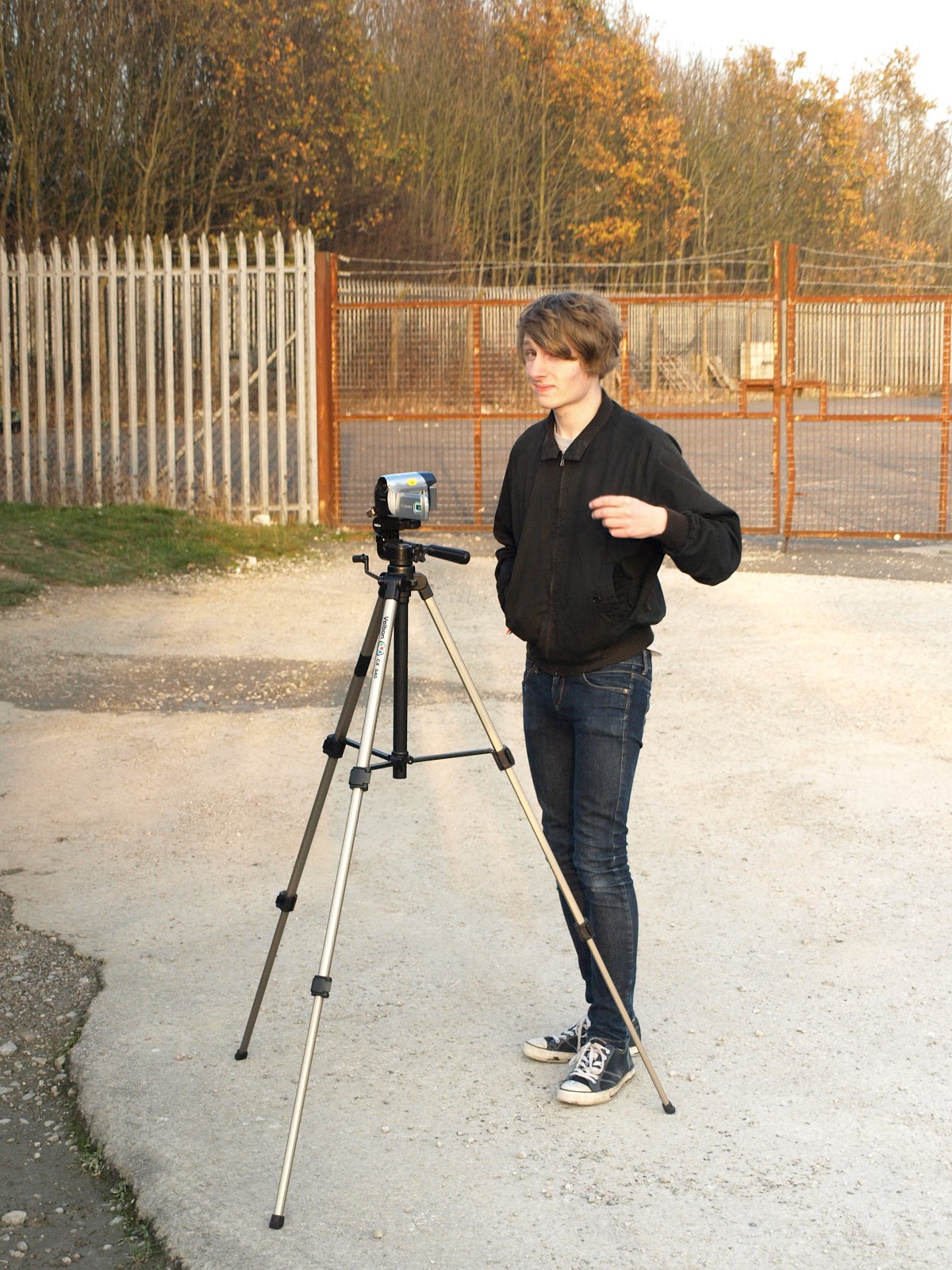
On Saturday we shot the performance section of our video. Sarah took some photos before and after we did the shoot, and during filming. We plan to use these photos on the band website as a "behind the scenes" post on a news feed or something similar.


Setting up the cheap homeless person "drumkit"

Me filming. I think

Run through of the performance