Monday, 31 October 2011

Website Analysis and Research 1: New Found Glory

To help us in designing our own web page, we have been looking at web pages for other bands of the pop punk genre, seeing how they match up. 
 
Images and Logo: The webpage uses the bands current logo, as you would expect. A web page serves to sell the band in an up to date, almost to the minute way. The background is made up of the image from their recent single, which serves the same purpose as the logo. The icons next to each news article are animated, which adds extra flare to the page.
Genre: The use of a colourful pallete (at least for the background) is a typical convention of Pop Punk design. The over the top use of exclamation marks is also a factor that we see a lot in Pop Punk: Everything being a bit more over the top and extreme than it is in the real world.
New Technology and Links: As you'd expect from any webpage, it's riddled with links to other places for our attention defecit generation. There's links to Facebook, Myspace, youtube and iTunes in the top right corner, and on the right a link to buy the new single and just below that, although not pictured, are tour dates and a link to buy tickets.
Colours and Style: As stated, the colour pallet is a vivid, varied one. At least, this is the case for the background, whereas the foreground is mostly white and black. I can only assume this is because text would have been nigh on impossible to read over the background images, so this was obviously substance over style.
Written Content: The written content boasts an informal style. Graphologically, the repeated use of exclamation marks is a good example of their attempt to fit in with the conventions of the pop punk genre.
Font and Layout: The font is a fairly standard one throughout. Again, I would say that this is for practical reasons, and really, after a year of playing with different fonts when Word came out, everyone got bored and went back to readable fonts instead of ten foot green hedge type letters.
Target Audience: When considering everything I've said above, the target audience is naturally, youngsters of about 15 to 20. That at least, would be the regular clientèle. Occasionally a mum or dad might have to come on and buy a ticket or CD for their kid, which is why it's so simple to navigate, for the less internet savvy.

Website Analysis and Research 2: Sum 41

To help us when planning and creating the designs for our own homepages, we needed to look into the websites of other artists within our genre. The first artist I chose to look at was Sum 41, who are also an American pop-punk band. Here is a screen shot of their homepage:


Images and Logo:
With regards to images and logos, this is pretty much the main bulk of the homepage. The background is an image of what seems to be a grungey, dirty wall lined with graffitti which promotes the punk idea. In the foreground we get the band logo and a picture of the band themselves, followed by the name of their new album. The image is set out like a film poster, which is an interesting and effective way to promote the band and their new album.
Genre:
There are several factors included in this homepage that emphasis the conventions of the genre pop-punk. The dull colour scheme and use of ideas such as graffitti add emphasis to the punk side of this genre. Along with the costumes and over style of the band themselves, the black and white photoraph really boasts a pop-punk image that will appeal to their target audience.
New Technology & Links:
The inclusion of a mailing list is pretty much the only piece of new technology present on this homepage. It seems they've gone for quite a minimalistic frton page, which is perhaps why this is the only thing we see. Maybe when delving into the site further, there would be more evidence of new technology and links to external sites etc.
Colours & Style:
Typical of pop-punk, there is a grungey, neutral and dull colour scheme present, and the style reflects the genre very well with the presence of graffitti and such like.
Written Content:
There is very little written content. The promotion of the new album and the band name are used as the main bulk of the written content. Other than that there is some writing regarding the mailing list, but besides that there is very little text to be found on this homepage.
Font & Layout:
It appears there is a general overall font being used throughout, which is bold and striking. This in-your-face text could reflect the nature of the genre. The layout is central and uniformed which gives the page a very professional feel yet the use of background and other visuals still gives off a punk feel.
Target Audience:
I feel the target audience for this website is mainly fans of the band as there is little written content accompanying the homepage. I feel that it is assumed fans will be visiting the page, and therefore explanation into the album promotion and band itself is not necessary. They target the fan base by immediately offering up a mailing service which would only appeal to fans. It is assumed that fans of this band would be punk/skater types, likely to be associated and familiar with the graffitti and film poster aspects to this webpage. The visuals very much appeal to the youth.
Advertisements:
There are no advertisements as such on this homepage, however there is evidence of promotion for the band's new album, "Screaming Bloody Murder". Other than this, there are no advertisements present.

Previous Student Work 2


I'm fairly at odds with this, I love the song so I was instinctively expecting something great, but this was a little dissapointing. I think the locations really suit the indie genre and look great. The train station, the pub and the old, dirty looking streets all really fit the song. I can't help but feel that all of the shots last far too long, not only for a fast paced song but for a music video anyway. Some of the shots are fairly shaky and there isn't much variation. The performers look bored and awkward more than anything and it doesn't look to me like they're rapping. I probably would have given this maybe 25 out of 40 at the most. But then maybe I'm just being harsh.

Previous Student Work 1

The Pipettes - School Uniform

http://www.youtube.com/watch?v=CLqSscAdws4&feature=channel_video_title

This video for a song by the Pipettes shows a mix of both performance and narrative, which makes for an interesting music video. The narrative is very strong and fits with the lyrics and theme of the song. The lyrics help to assist in the creation of a good narrative that keeps the audience engaged and entertained. There is no element of conceptual in this video, which is probably appropriate given the theme. The visuals and mise-en-scene are very well thought out and fit with the song itself. They have paid very close attention to detail when picking out costumes and location.
The main strengths of this video include the narrative and varied use of camera shots, which hand-in-hand make for a very interesting video. The shots are steady, well planned out and framed and include a wide range of shot types from close-ups to long shots and similarly there are varied angles too. The continuity is perfect throughout.
There are few weaknesses in this video, however I suppose it is arguable on occasions that the acting could be taken a little more seriously, however within the context of the song and the video, it is not entirely necessary for the actors to be completely serious.
It meets the conventions of the genre and the artist as it is very girly, pop, upbeat video. The bright colours and mise-en-scene included are very much suited to the genre and the artist themselves.

Overall, I would give this music video a full 40/40 as it is pretty much flawless. They have clearly taken a lot of time and effort in the making of this video, throughout not only filming and editing, but also their research and planning stages.

Digipack Research 1


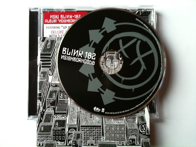
The entire kit and kaboodle from Blink 182's most recent album, Neighborhoods. The cover and booklet are unusual in that it's black and white. This is a departure from not only the use of many, bright colors within Blinks past albums, but within the albums of most pop punk bands. On the actual cover is an image of a suburban area with Blink 182 being spelled out on the buildings. This is obviously referencing the albums title, Neighborhoods. Also we see several references to and tributes to friends and relatives, scrawled in graffiti on the buildings. The likes of Ava and Jack are children of the band members, and we see DJAM as a tribute to a friend of the band who passed away. On the actual disc, is the standard Blink smiley face, first used as the cover for their 2004 album and which has since become their icon.

This is obviously going to be very important in the designing of our own digipacks. This is the only example we have of a digipack from Blink 182's new look, and as such we will be keeping this in mind throughout.


Blink-182+-+Neighborhoods.jpg

Textual Analysis 1 & 2


These are the textual analyses completed by Sarah and myself on videos from our chosen artist, Blink 182.

Non Verbal Communication 2

In a lesson a few weeks back we discussed the idea of Non Verbal Communication (NVC) and it's importance and effectiveness in the makings of a good music video. As such, I have looked at a video by our chosen artist, and have analysed the NVC aspects of it.

The video I have chosen is The Rock Show.

COSTUME:
Blink 182 as a pop punk aren't known for elaborate costume changes within their videos, and as such within this video there are no costume changes. Apart from the performance bit where Mark Hoppus, the bassist is wearing glasses, which had never done before or ever done since.

POSTURE:
Nothing out of the ordinary within the posture here. Tom Delonge, the guitarist has his famous guitar hung down low and sort of bends over while he plays it.

GESTURES:
Very important use of gestures in this video. During the "live" performance sections Tom and Mark swing around their guitar and bass and jump around which is integral to the energetic feel of the video. In the section where we see the band playing in a small room, Tom spits at the camera, which is reminiscent of a typical punk rock attitude.

FACIAL EXPRESSIONS:
Nothing really here. When they play their faces are flushed with an angsty type of concentration which is  typical of them. The sections where they're running round town spending the money show their facial expressions as always smiling and laughing, which really helps convey the fun feel of the video and the song.

SPACE:
The sections where they're running round town are shot to look homemade, so space is always quite haphazard and always fairly far away. The performance scenes show some real close ups, and the part where the band are in the box room is shot down a fish eye lens, which makes them feel closer than they actually are.

Thursday, 27 October 2011

Summer Homework Revised

Activity One: Music Video Analysis. 
PART ONE: GENRE


What elements does your artist use to identify themselves in their videos?
In more recent times, Blink-182 have made themselves identifiable through the use of their logo, which is very recognisable. They have always seemed to keep with an image that is genre specific, wearing punky, dark clothing that conforms to the conventions of the pop-punk genre. In the same vein, however, they wear clothes that are fairly normal, meaning their look can be related to and imitated. I feel this use of styling and image makes them recognisable and identifiable within their videos. In the earlier, more immature days of Blink, they used less traditional and sometimes amusing methods to be recognised, which often went with their music and promoted the ideas of punk and youth. For example, in their earliest days they sported dyed hair and fooled around in their videos. Similarly, even later on into their career, Blink-182 used humorous visual aids to identify them i.e. parodical costumes, nudity and profanities.

Dark Clothing                                                   Use of Logo                                         Immaturity


How has your artist changed over time? As mentioned briefly before, Blink-182 started off slightly juvenile and immature. This fitted well with their genre of pop-punk and made them a relatable and likeable band, as shown with their video for “Dammit”. Their music at the time reflected this view on life and consequently their videos followed suit. As they began to grow up a little and evolve as a band when finding success, they started to approach more serious subject matter in their songs which understandably lead to music videos that were more serious and meaningful, for example with “Stay Together For The Kids” or “Adam’s Song” . Saying this however, even in amongst their serious songs, there remained the comical side as from the same album as “Stay Together...” came the music video for “First Date” which is both an amusing narrative and a parody of the Bee Gees.
 Dammit                                                             Stay Together For The Kids                First Date

What generic conventions are evident from their videos? With the genre of pop-punk comes the ethos that life shouldn’t always be taken so seriously and therefore, Blink-182 tends to use this convention on several occasions. This idea of rebellion (as seen in “Feeling This” and the general punk outlook on things is often displayed too, for example in their video for “Rock Show” they take the money given to them from the production company to make their video and use it in any way they see fit. There are displays of irresponsibility and disrespect, which is a clear convention of the genre punk and consequently the sub-genre, pop punk. Dull and neutral colours and dark settings are used in their videos which is also generic of punk/pop-punk videos i.e. in “Adam’s Song”

Feeling This                                       Rock Show                                       Adam’s Song

Has the film style changed over time? If so, why? I don’t believe their film style has changed considerable over time. If you compare their videos based on content, you can see that over the past 20 years, their style hasn’t changed much. For example, if you take the video for “Josie” or “Dammit” from their second album and compare it to “First Date” from their fourth, you can see that when they wish to be humorous, their videos are made in the same sort of way. In this case, narrative and performance are of about an equal split and have the purpose to amuse and entertain the audience. Similarly, when you take into consideration their newest video from their sixth album, “Up All Night” which is a more serious song and compare it to songs from their third such as “Adam’s Song” you can once again see that their film style is once again very similar, including both performance and narrative and using the appropriate genre conventions.

PART TWO: VISUAL STYLE AND IMAGE.

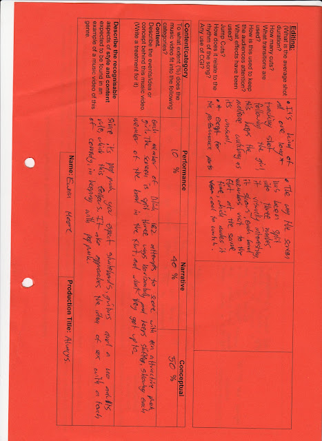
“Josie” & “Up All Night” Here we have two very different concepts for a music video, which fit into the context of the songs they are promoting. “Josie” is a song that is light-hearted and fun. Within the video, we get a mix of both performance and narrative and it is not at all conceptual. There is humour in the form of visual gags and acting whilst the narrative involved is also fairly humorous in itself. On the other hand, the video for most recent release “Up All Night” has a concept that is not at all humorous, which displays acts of rebellion and destruction. Once again, as is common in most (if not all) of Blink-182’s videos, the video is pretty much a 50/50 split of narrative and performance. It is rare that conceptual ideas are used in Blink-182 videos, however it is seen in the video for “Always” where there is a simultaneous, 3 way narrative occurring in a split screen. With regards to genre conventions, I’d argue that “Up All Night” holds the most, with a dark, run down, destructive setting and visual elements such as fire. “Josie” attracts a youthful audience with the use of a familiar setting (in the form of a movie theatre) whereas this is not strictly a convention of their genre. The humorous side to it, however, is a genre convention of pop-punk which makes it recognisable to an audience exactly what genre it belongs to. The costume choices in “Up All Night” also help to really emphasise the genre, as there are clear punks and skaters alike in the video.


Activity Two: CD Covers
PART ONE: Analysis

Blink-182 - Neighborhoods 
Sum 41 – All Killer, No FIller
New Found Glory - Catalyst
Fall Out Boy – Take This To Your Grave
Each of these artists come from within the same/a similar genre to Blink-182, and therefore I thought it would be interesting to compare their choice of album cover. The first – Neighborhoods by Blink-182 – is a fairly simple cover that has relevance to its title. Emphasis lies on the band name and there is no inclusion of the band themselves in the cover art. The dark and contrasting colours fit with the genre conventions of pop punk and the image of an urban setting is the sort of detail that makes the band seem relatable. The Sum 41 cover takes your more conventional humorous, juvenile approach with several amusing pictures. Once again, there is a large emphasis on the band name. Similarly, the New Found Glory cover also takes a less serious, more comical approach as there is a cartoon style image that takes up the entirety of the cover. The band name is once again highlighted and I think this is a feature that may be present in most album covers of pop-punk bands. Lastly, the Fall Out Boy once again boasts a noticeable band name which is probably the main focus. Strangely, this is the only cover of the bunch that shows a portrait of the band themselves which is odd, yet effective. The cold and dark colours once again fit with genre conventions.